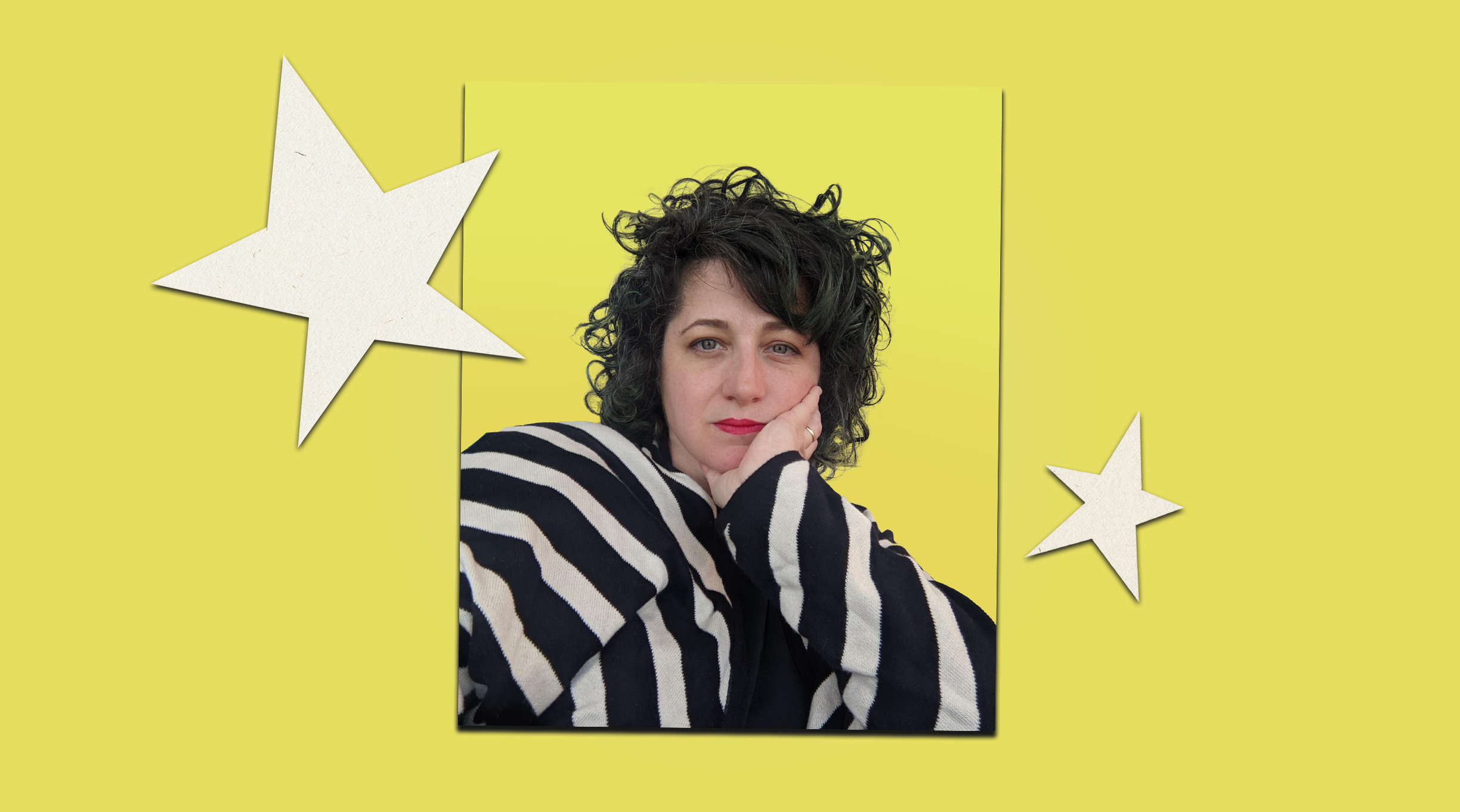
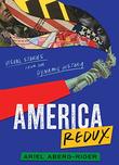
In America Redux: Visual Stories From Our Dynamic History (Balzer + Bray/HarperCollins, May 2), Ariel Aberg-Riger combines captivating collage art with text written in an energetic and fluid font she created herself to illuminate pivotal and often rarely discussed episodes in U.S. history, from celebrations of eugenics at county fairs to the decision to turn Diné and Hopi lands into a national sacrifice zone for destructive coal mining. Her nonlinear approach features brief chapters that feel as if they are in conversation with one another; these loosely related stories invite readers in, engaging them with history in a thought-provoking and invigorating way. Aberg-Riger, whose art and visual stories, both fiction and nonfiction, have appeared in diverse publications and formats, answered questions over email; the conversation has been edited for length and clarity.
What drew you to write for young adults?
When I was writing visual stories as articles for places like CityLab, my work was written for adults, but my favorite feedback was always when educators would tell me they were using my pieces in their classrooms and that young people were really responding to them. As I went through the process of finding the book a home, it really became clear to me that it was meant to be made for young people.
I never connected with history when I was younger. It was always my least favorite subject (and I was a kid who really loved school!). It felt like date after date, discrete fact after discrete fact, war after war. And when that is the model of history you’re given, it’s really easy to disengage. Unlearning how I thought about history took decades. If I can get a 16-year-old super amped about history, to see it as this living, breathing, cool, collage-based thing that they have the power to influence, that they are history? That to me is just the ultimate.
Did you develop the visuals alongside the text?
The process is definitely intertwined. I start out in a way that I imagine is how most nonfiction writers start out—I get excited, and I start digging! I read and watch and listen and read and read and read. On the visual side, as I am doing that deep dive, I’m also tentacle-ing across the internet to see what images are available—looking through digital archives, doing image searches, and following images back to their sources.
 Once I’ve collected as much as I think I’ll need, I get to the hardest part (for me at least), which is figuring out the story I am trying to tell. Where am I placing the start? How much am I trying to get my arms around? What is the arc? What am I including? What do I have to leave out? As I’m figuring that out, the visual tone and approach are also evolving in my mind—what will the visual atmosphere for the story be? The colors? The style? The feeling?
Both are driven by the material I’ve collected, and there are always constraints out of my control. For example, in the chapter about AIDS activism and ACT UP, the majority of images I could find in the public domain were centered around the Storm the NIH protest, because they were protesting a governmental agency and the NIH had them in their archive. That led me to frame the chapter around that one specific protest, which helped me tighten my focus, so I wasn’t trying to recap every action the group organized (which I was tempted to do because they were all so rad!).
I’m always thinking and blocking visually in my head as I do the words. Even though I always start with the writing, if I get stuck, I switch to collaging. It’s one reason I love visual storytelling so much—you can just go back and forth, switching sides of your brain. And working on one side always manages to unlock and illuminate pieces of the other.
Photography often feels “true” to people even though it’s as subjective as any other medium; the way you juxtapose photos against each other and the text in your collages will lead readers to perceive them in a more critical way.
You’re completely right, of course, photography is just as subjective as any other medium. Who took the photo, how they took it, who decided to add it to the archives, how they cataloged it—there are so many layers. I could pull a single image from the archives and put it onto a page in a thousand different ways—against different stories, layouts, coloring, cropping, alone, with other images, how it’s placed, what it’s juxtaposed against. It all matters.
One thing I love about visual storytelling is that the images not only create an atmosphere for the reader to swim in, but they also change the reading experience. Our eyes and brains are so accustomed to racing along strings of words. Visual storytelling slows us down, and that changes how we enter the stories and how we feel them.
One thing that infuriates me about traditional history textbook design is how ugly it is, and what terrible treatment the images get—shoved into the corner of the page, teeny tiny, black and white. There are so many incredible images in our archives! Why not let them take up space? I want to be engulfed, I want to see them.
Another thing that was always important was that I make the sources transparent so that readers could not only see the original image and who took it, but also the context in which it was created. I created a database, which readers can access on the book’s website, so you can not only learn more, but also download the images and play with them.
There are so many attempts to censor history that some people find uncomfortable; you shed light on topics many try to erase from the curriculum.
One thing that that history does so beautifully is that it exposes power. When you go back in time and follow the stories, you realize that nothing just “is”; everything—every system, every structure, every norm—has been created and built and fought for. Certain people worked really, really hard to gain power and build power and hold on to power, sometimes by doing pretty brutal things. I find that the people most inclined to want to censor history are the people who are most afraid of exposing, and therefore possibly losing, their power. Whether it’s about race or gender or class—the people who have power often have a very hard time reflecting on how they got it. And what they’re doing every single day actively (or passively) to keep it. It’s much easier to just pretend like it’s some natural state of the universe, and when you read history, it’s really hard to pretend that! Once you start asking questions it all comes undone, in the absolute best of ways.
What do you hope readers will take from your book?
In the preface I say, “Forms change us, and I hope this book changes you.” I hope readers take this book as an invitation. An invitation to keep digging and reading and questioning and making.
Laura Simeon is a young readers’ editor.


